Continuous Improvement, Core HR
Here’s something you probably didn’t talk about much at holiday cocktail parties: data visualization. But it’s something I think about a LOT.
For the past few months we’ve been working with a large company to gather and interpret their people data. It’s been a massive undertaking, with data sets coming from over 90 countries. We’ve had to address employment laws and standards across multiple continents, and getting a highly distributed and global stakeholder group up to speed took time.
But you know what was even more complicated? Figuring out the best way to present our findings to the client. That’s the thing with data — collecting information is only half the battle. If you can’t tell an interesting story, the data is useless.
That’s where data visualization comes in. Representing your information graphically can make your findings easier to understand while also propelling the conversation forward. If you’re trying to make a data-powered argument to a client, to your board, to the C-suite or to the person in the office next to you, here’s how you can use data visualization to turn a spreadsheet into a story.
Practice Good Data Hygiene
So what do I mean by “data hygiene”? Data is just a bunch of 1’s and 0’s; it’s not like you need to brush it twice a day, right?
Actually you do! Because if you slip on your standards for data collection, your data can get rotten incredibly quickly.
The first step in maintaining good data hygiene comes before you begin collecting any data. Sit down with your team — in person, on a video call, on Slack, whatever — and set your taxonomy: Establish your common standards and definitions, no matter how nitpicky you might feel.
I’ll use a past project as an example. As we collected employment data for a client, we ran into some confusion over the definition of the term “employee.” Did it apply to full-time workers only? What about part-time workers and contractors? You can enter a Twilight Zone of confusion very quickly.
The next step is to do the same standardization process with your tools. Excel is a pretty common standard, but perhaps you’re using something else. Maybe there’s a certain software or process you need for a specific purpose. Either way, be clear about how you’ll collect and organize your data.
Following these steps for good data hygiene means you’ll spend a lot less time cleaning your data. Even better, your team will be empowered to work more efficiently and independently, and you’ll have more time for the fun part: the analytics.
The Power of Visual Tools
A lot of people in my field, myself included, are real data geeks. In our eyes a well-organized spreadsheet is a work of art.
But not everyone has the experience to read a spreadsheet. So it’s up to us geeks to translate the data into a story that tells your audience the insights you’ve discovered.
This is where data visualization comes in. Visual tools can be amazingly effective for storytelling. The human eye responds to visual stimuli, and charts and graphs can create the context people need to process understand data. There are countless pieces of software you can utilize to transform your data into something museum-worthy. One of my favorites is Tableau, but there are plenty of other phenomenal tools you may prefer.
But just because you have some software and some data doesn’t mean you can just plug and play your numbers and have a finished product. Choosing the most effective way of visualizing your data can be enormously daunting. There are quite a few options. Should you go with a scatter plot? A line graph? Or maybe a donut chart sounds tasty…
So as you sift through your data, think creatively about the best visual tools to present your findings. Remember, presenting the data is only part of the storytelling process; you’re also trying to elicit a conversation.
Try to anticipate your presentation. What questions will people ask? What data points do you think are most important? Finding these points of emphasis will help you figure out how to tell your story.
Here’s the part where I geek out. We data geeks all have our personal favorite visualization tools. I think heat maps are great ways of drawing the eye to points of emphasis:
I’m also a huge fan of Sankey charts, which dramatize flow — for example, the flow of information — through a system: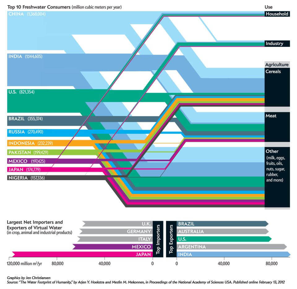
Pretty cool, huh?
If you’re looking for more inspiration, take a look at the 2018 Information Is Beautiful award winners, like this representation of population growth and immigration in the U.S.:
Don’t Forget the Story Behind the Story
Here’s a familiar situation: You’re running on caffeine and adrenaline, presenting your findings to your team. You’ve spent months crunching the numbers and getting it right — and then your client or boss begins to question the very data you’ve spent months collecting. It takes all of your effort not to throw your laptop.
But as frustrating as that situation always is, questioning data is actually a completely natural instinct. We human beings struggle when we encounter information that challenges our preconceived notions. And a lot of times our people data turns up surprises.
That’s why it’s not just important to craft the story you want to tell. You also have to craft something else: the story of how you collected that data — and why you believe that data is absolutely correct.
By providing the story behind the story, you can shift the conversation where it needs to be — from a technical, process-oriented conversation to one oriented around what’s best for a business and its stakeholders.
As we’ve discussed on Voice of HR before, it’s time for HR teams to take the lead. How can you do that? By collecting important people data, understanding the story in the numbers, and presenting that story in a compelling way. Data doesn’t have to be boring — it can be powerful and transformative.
Here’s to better, smarter, more interesting data stories in 2019!
